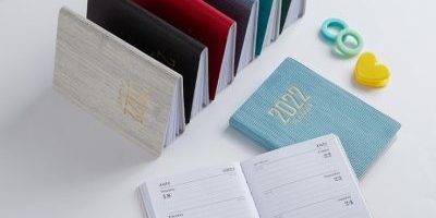
Pocket calendars are not just functional tools; they can also be aesthetically pleasing accessories. In this blog post, we’ll delve into the art of pocket calendar design, exploring how functionality and aesthetics can be harmoniously combined.
- Compact Size: The hallmark of a pocket calendar is its compact size, designed to fit comfortably in your pocket or purse. This practical design ensures that you can carry your schedule with you wherever you go.
- Layout Clarity: A well-designed pocket calendar should have a clear and intuitive layout. Each day, week, or month should be easily distinguishable, allowing for efficient planning and reference.
- Material Quality: The choice of materials matters in pocket calendar design. Durable paper or cardstock ensures that the calendar can withstand daily use and occasional wear and tear.
- Visual Appeal: Visual elements, such as fonts, colors, and graphics, play a significant role in the calendar’s aesthetics. These design choices should enhance readability and visual appeal without compromising functionality.
- Customization: Some pocket calendars offer customization options, allowing users to add personal touches like photos or artwork. This personalization transforms the calendar into a unique accessory.
- Inspirational Elements: Including inspirational quotes or images in the design can add a motivational dimension to the pocket calendar, serving as a source of daily encouragement.
- Binding and Closure: The binding and closure mechanisms of a pocket calendar should be secure and practical. Spiral binding, magnetic closures, or elastic bands are common options.
By paying attention to these design principles, pocket calendars can seamlessly blend functionality with aesthetics, offering users a visually pleasing and efficient tool for staying organized.


